Left&Ripe
Doing more with what’s left. Good fruit and veg goes to waste every season. Left&Ripe puts it in a can. Simple. Sustainable.
We provided
- Naming
- Brand identity
- Brand strategy
- Packaging design
- Website development
Credits
- The Author team
In the UK, millions of tonnes of food go to waste every year, much of it fruit and veg rejected for how it looks. Left&Ripe, a London start-up, set out to turn that surplus into something worth drinking. We named it, built the brand and designed the can.
Story
Left&Ripe started with a problem hiding in plain sight. The UK wastes around 10.7 million tonnes of food a year, and 3.6 million tonnes of food surplus and waste happens on farms alone. A lot of it is perfectly good. Researchers found that over a third of fruit and vegetables grown in Britain never reach the shelves because they don’t meet appearance standards. It’s too knobbly, too small, too oddly shaped. It’s still good to eat, but it’s not good enough to sell.
The founders saw flavour where everyone else saw waste. Their answer was a drink: low-calorie, low-alcohol craft session sodas, made from the weird and wonky fruit and veg that would otherwise be thrown out. It’s seasonal, locally sourced and guilt-free. The mission was serious, but the product needed to feel like a treat, not a lecture.
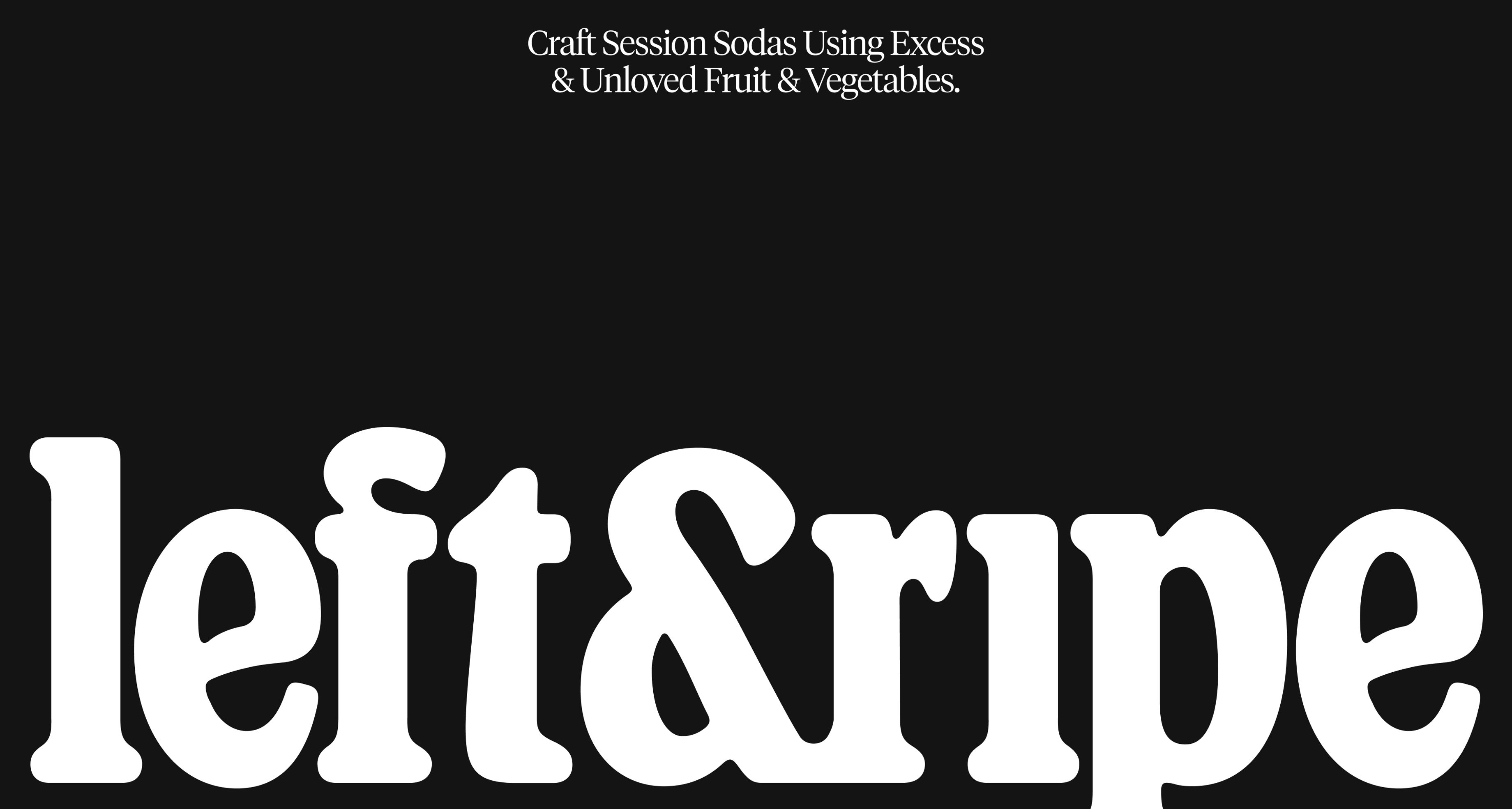
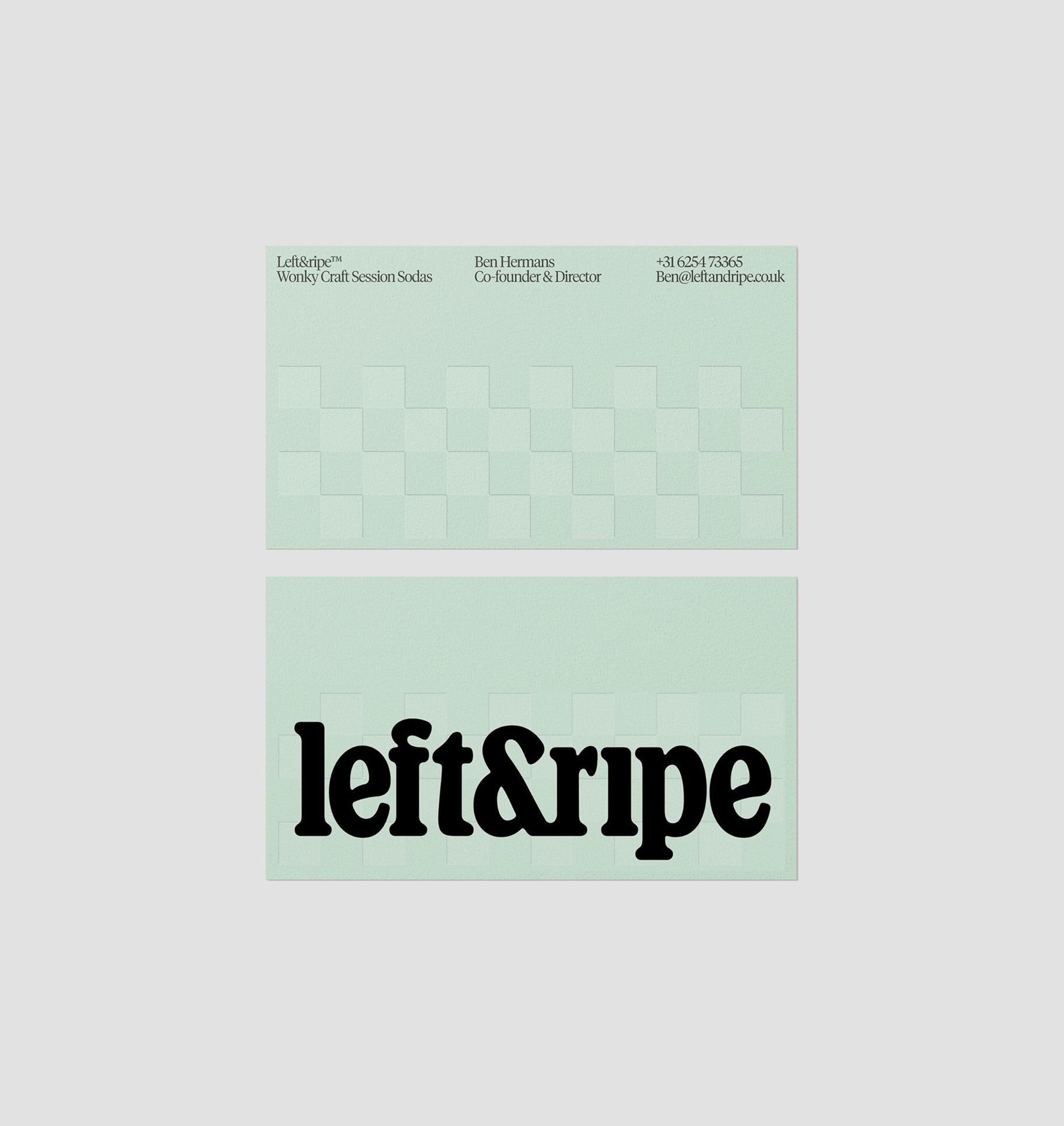
It started with the name. We wanted something right on the nose of the mission, something that explains itself before anyone reads the back of the can. Left&Ripe says it in two words: what’s left over, picked at its best. It also carries the idea at the heart of the brand, doing what’s right with what’s left. The ampersand ties the two halves together, the surplus and the good stuff, so the problem and the answer sit side by side.
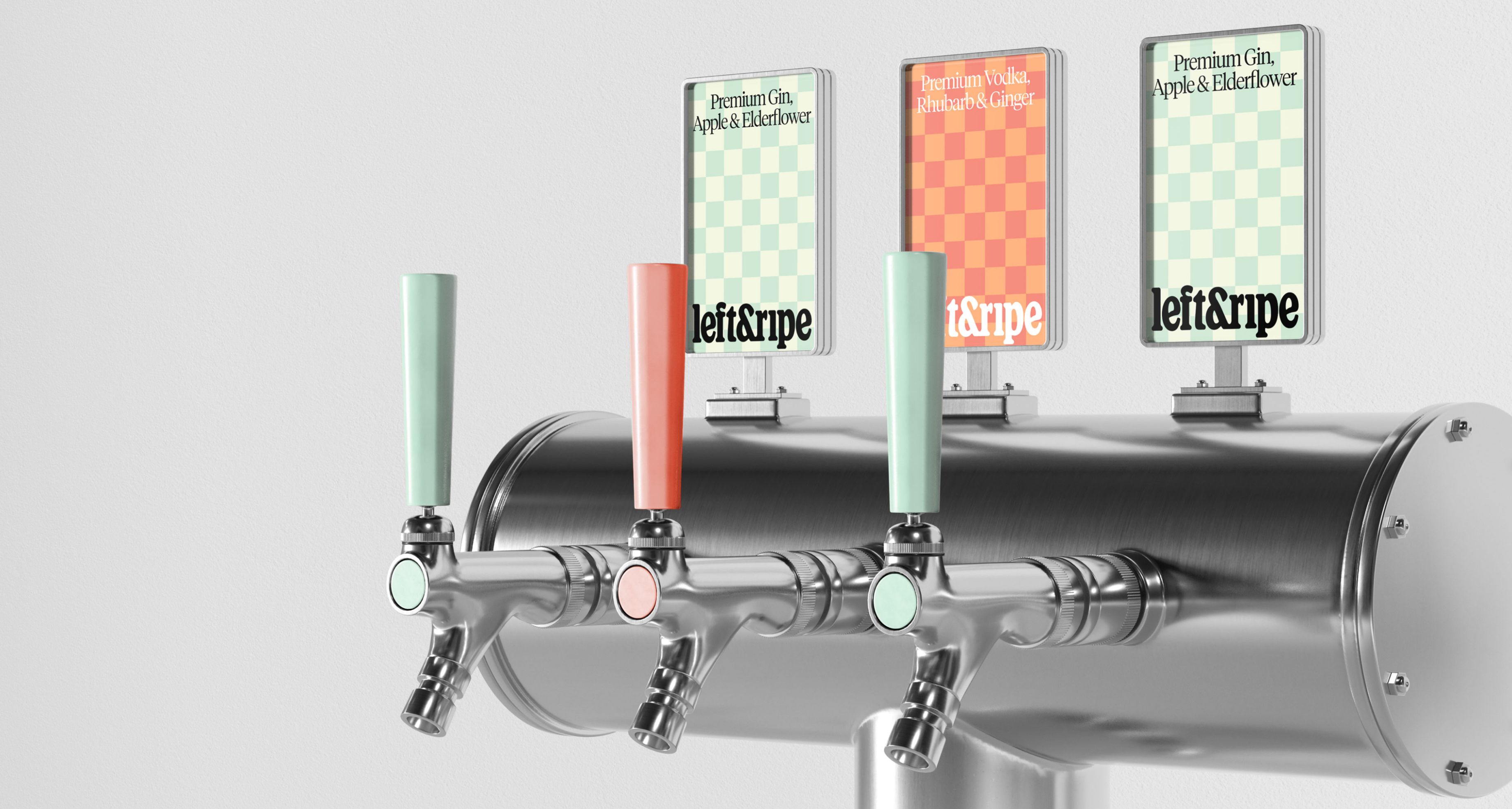
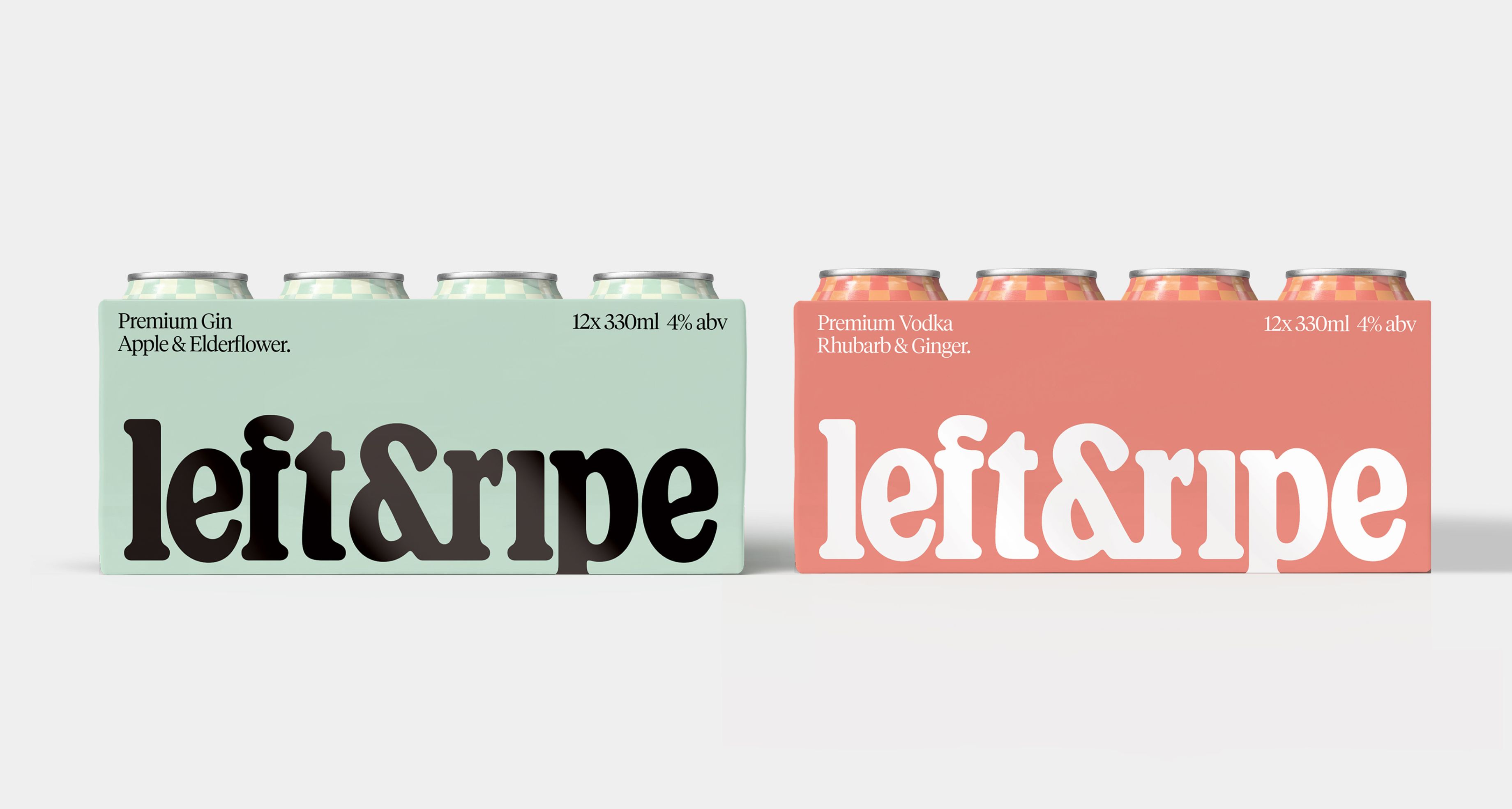
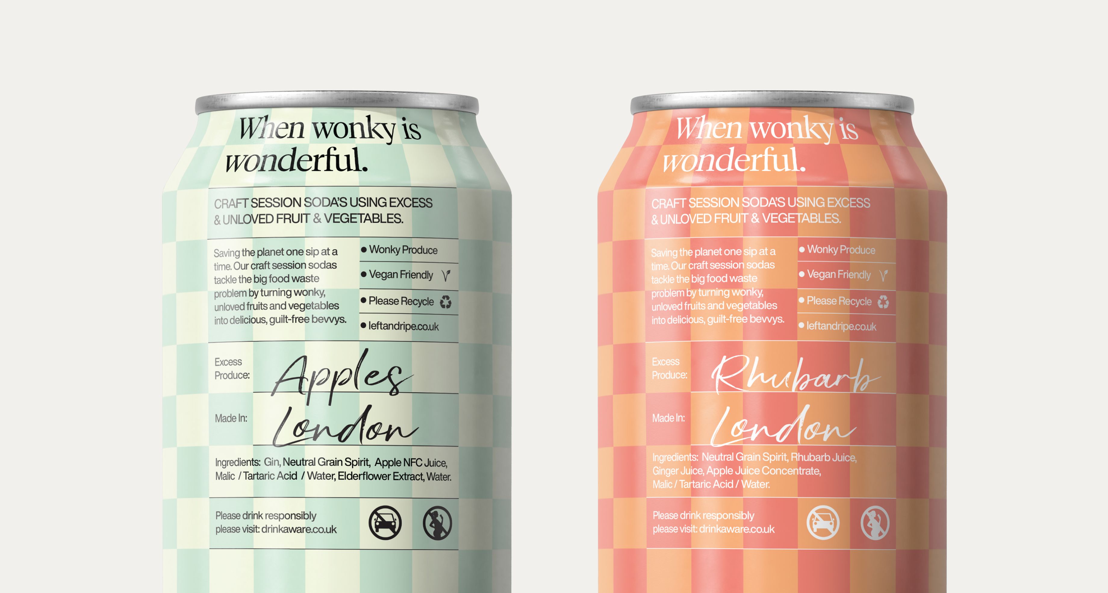
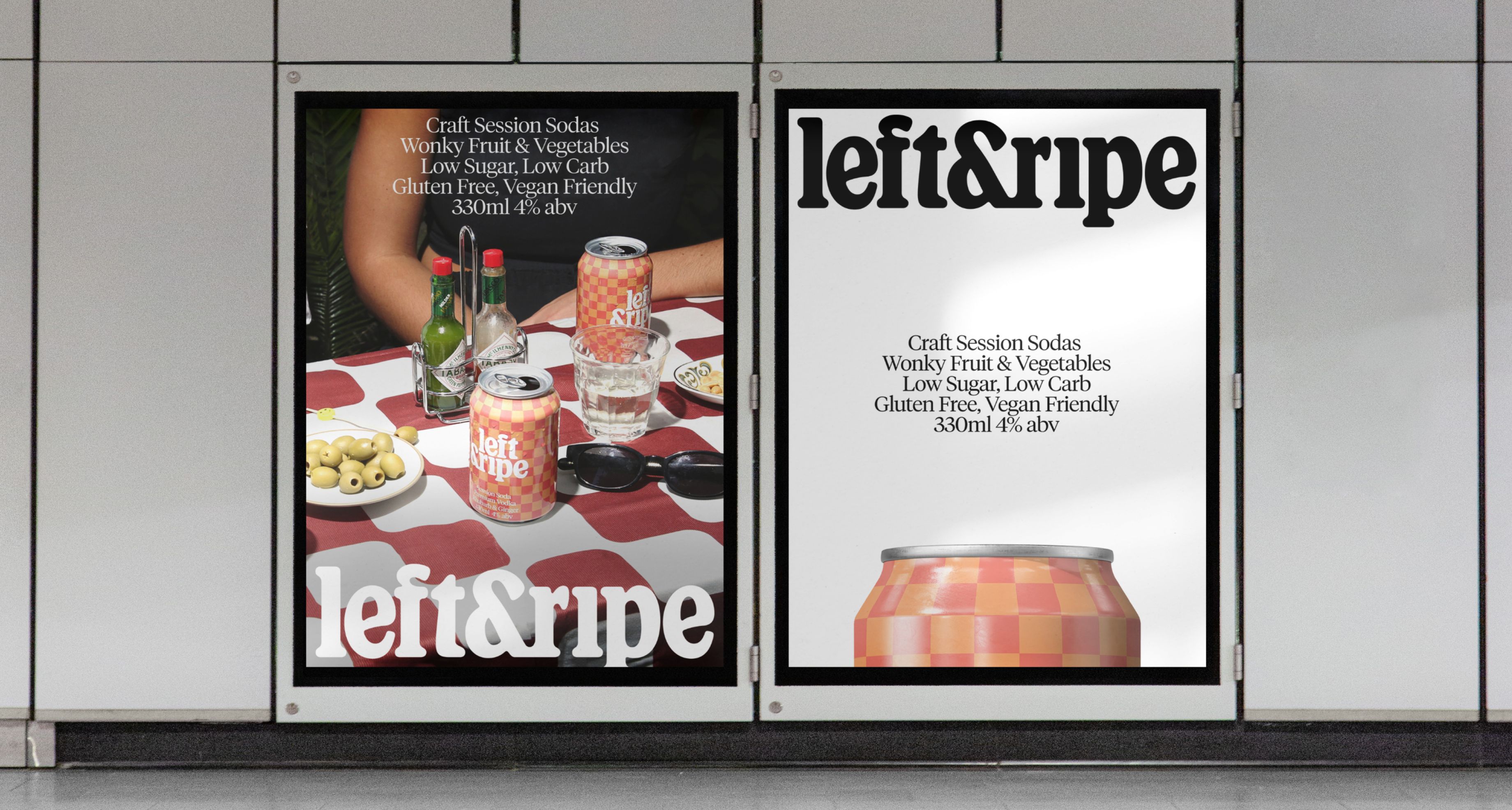
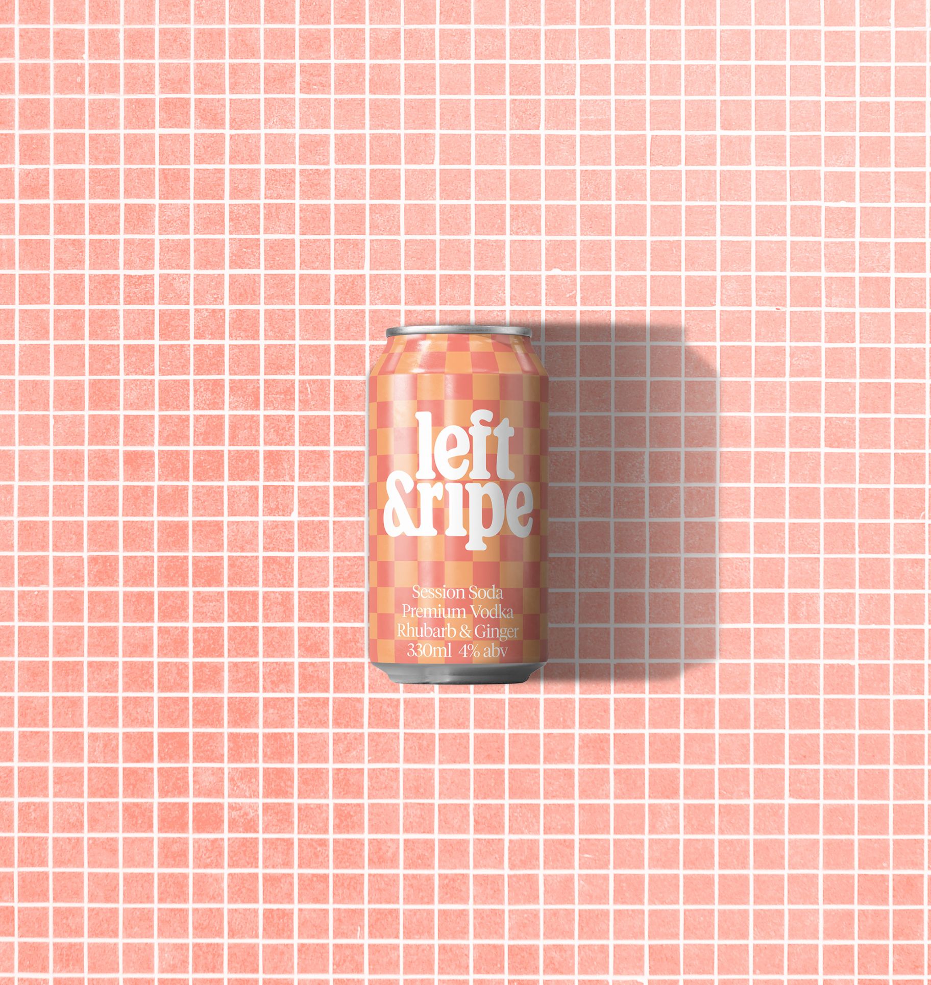
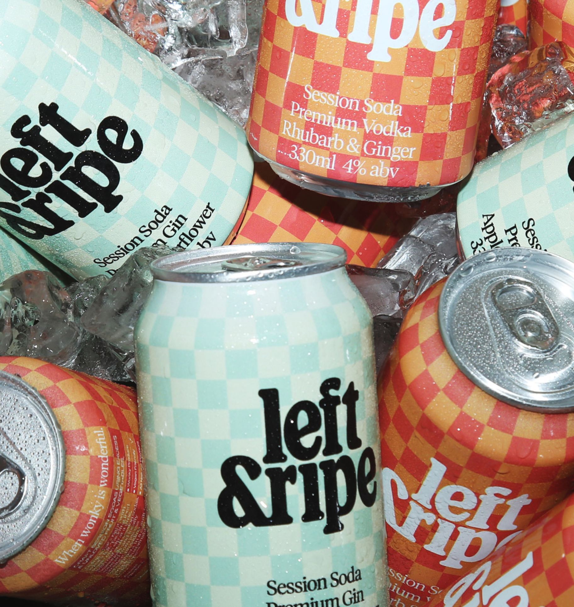
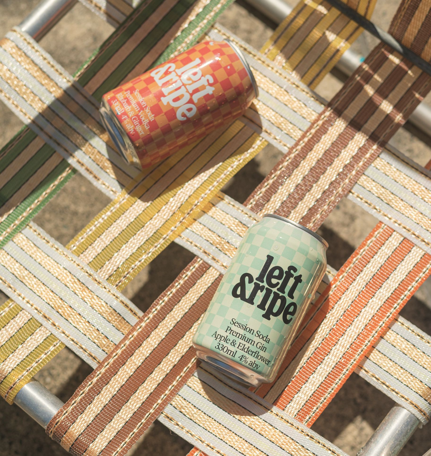
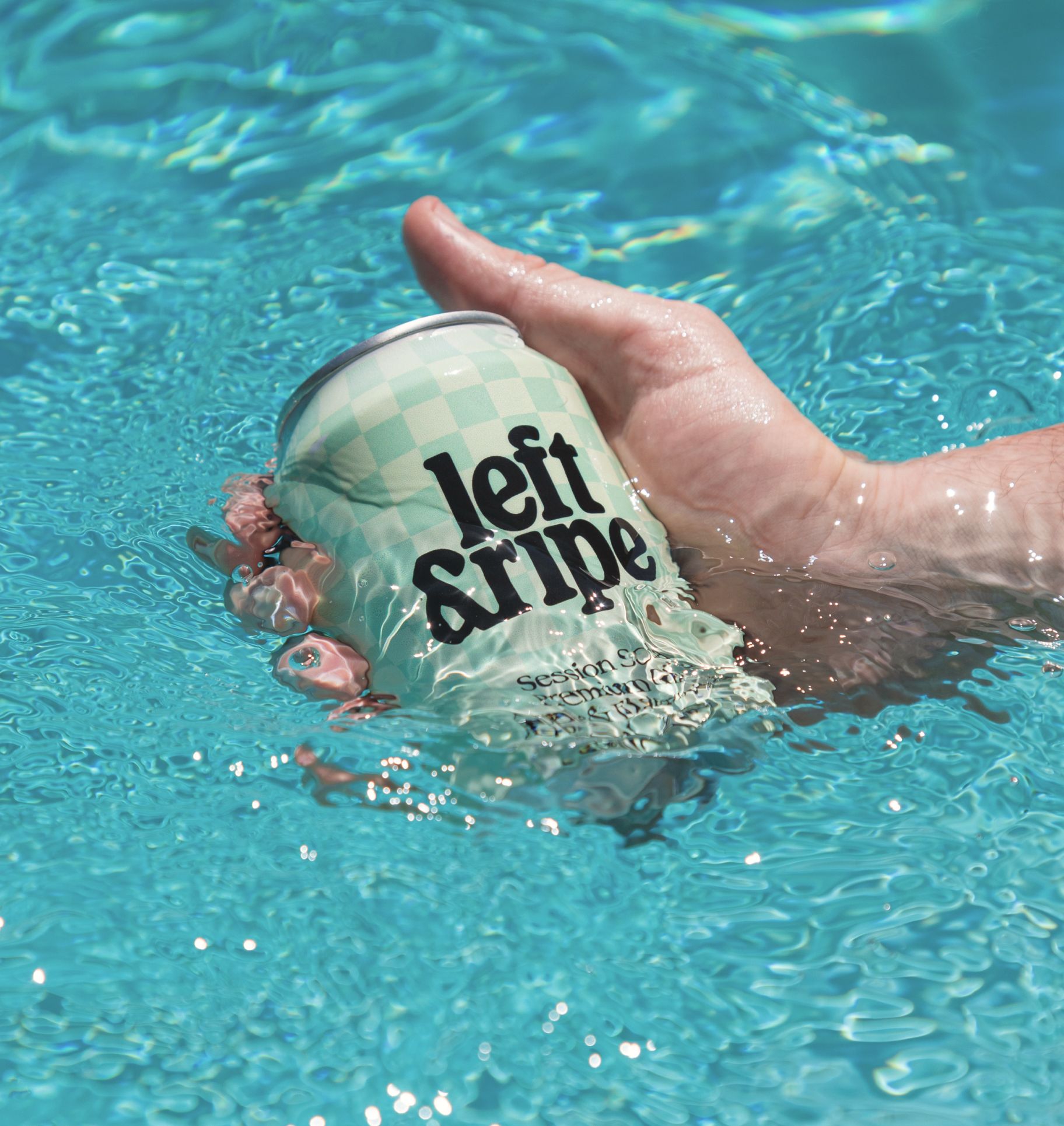
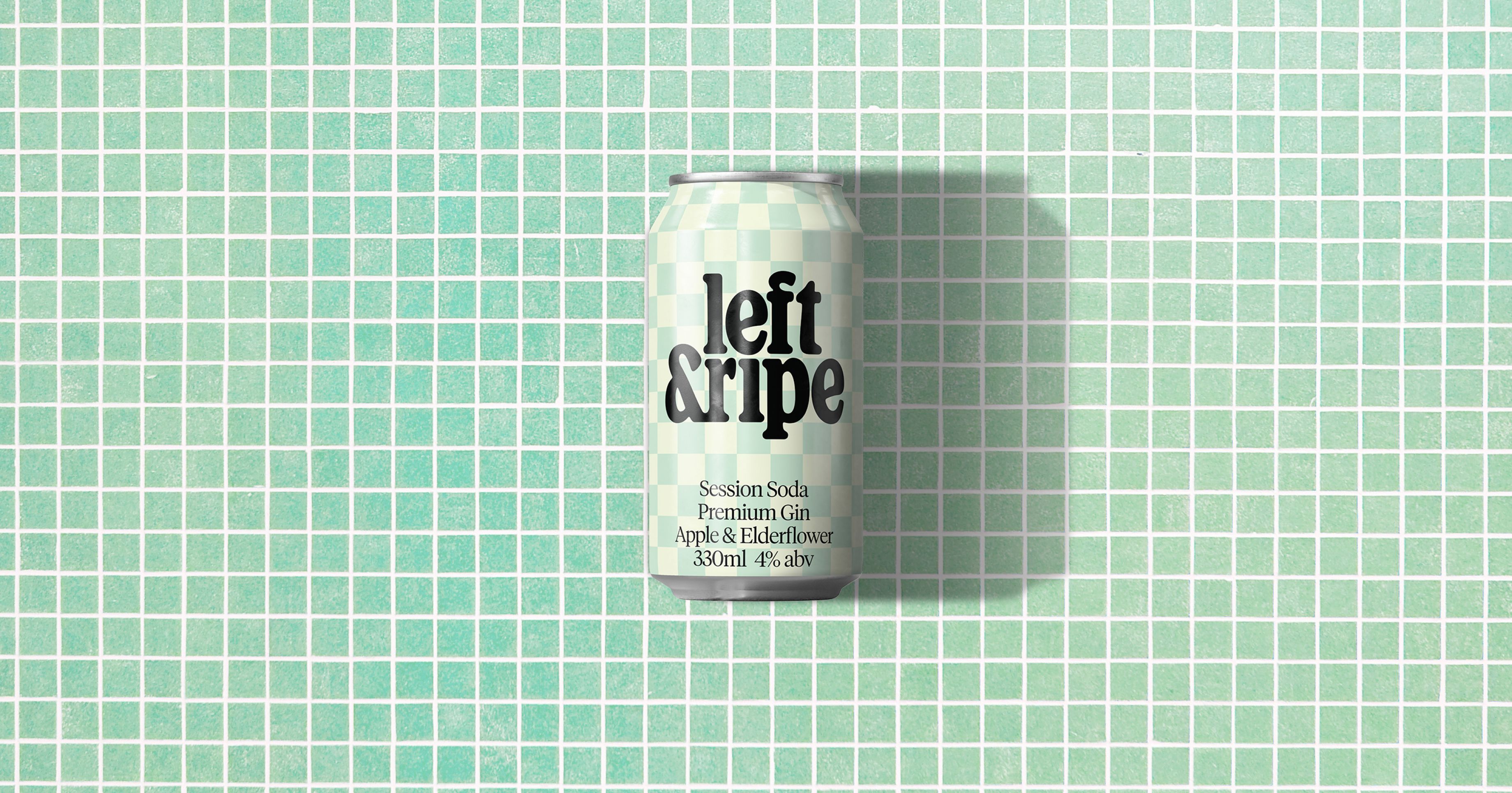
The identity needed one distinctive moment that could hold its own on a crowded shelf. We started with where people actually drink it, which is outdoors, in the sun, on a rug in the park with friends. That led to the picnic checkerboard. It’s instantly familiar, it carries the warmth and ease of a summer afternoon, and it works hard as a system. Each flavour takes its own brand colour within the pattern, so the range reads as a family while every can stays easy to find.
The can does the heavy lifting. From the far end of a retail aisle, the checkerboard cuts through. Up close, the name and the story tell you what’s inside and why it matters, without guilt-tripping anyone about food waste. It’s a simple, sustainable idea that’s easy to pick up and easy to come back to.
The same thinking carried into the website. The checkerboard, the flavour colours and the voice all carry through, so the brand feels light, fresh and easy to get behind wherever people meet it.